Design, Art Direction, Visual Identity
Creating a visual identity for Cisco Customer Experience
After one of my concepts was chosen, I was responsible for art directing and designing a new visual identity for Cisco Customer Experience (CX).
Visual identities assist teams in distinguishing themselves internally within Cisco. They are unique and easily recognizable; but most importantly, they do not compete with or dilute the Cisco brand. Therefore, the challenge was to develop a dynamic and flexible system that could be used by teams across the 27,000-person organization while still aligning with the corporate brand.
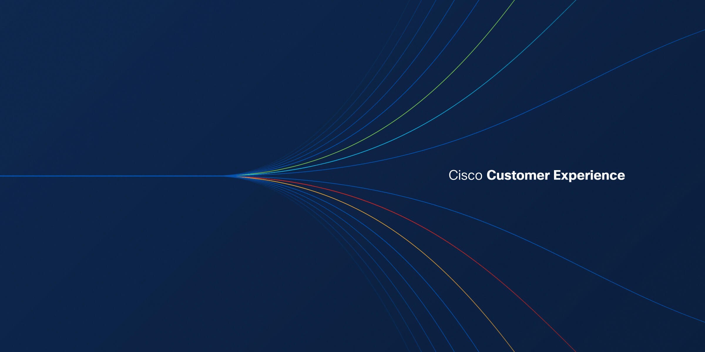
A final comp of the hero graphic
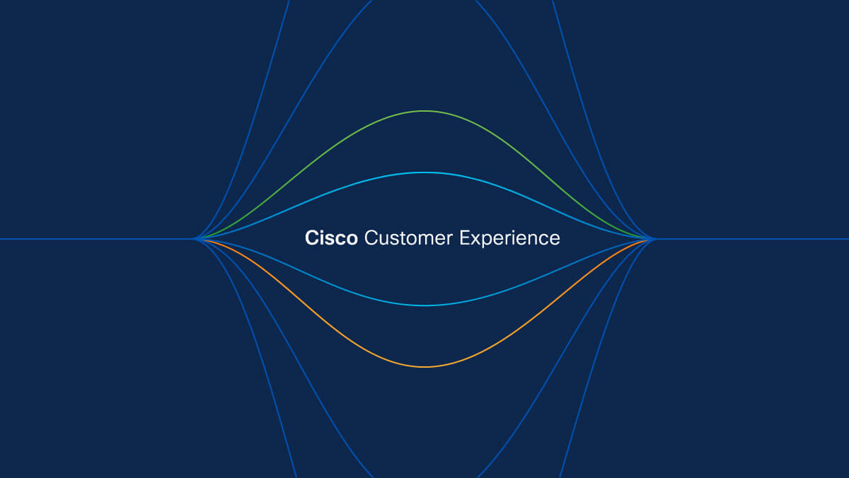
Initial concept

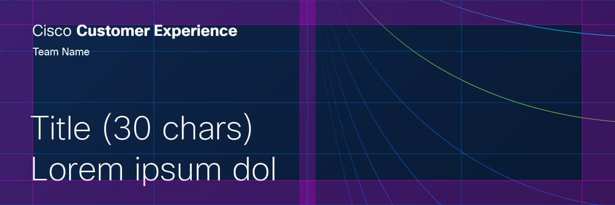
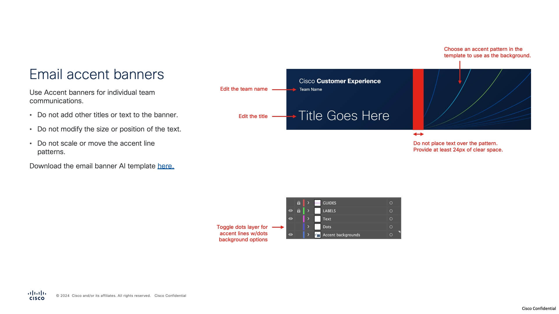
Banner example
The initial concept was a starting point and needed to expand to include more variation and flexibity, so that it could be used by teams across the organization and in different use cases.
As I began exploring different line patterns, crops, and colorways, my goal was to maintain a sense of movement with the converging lines, all the lines flowing towards a point.
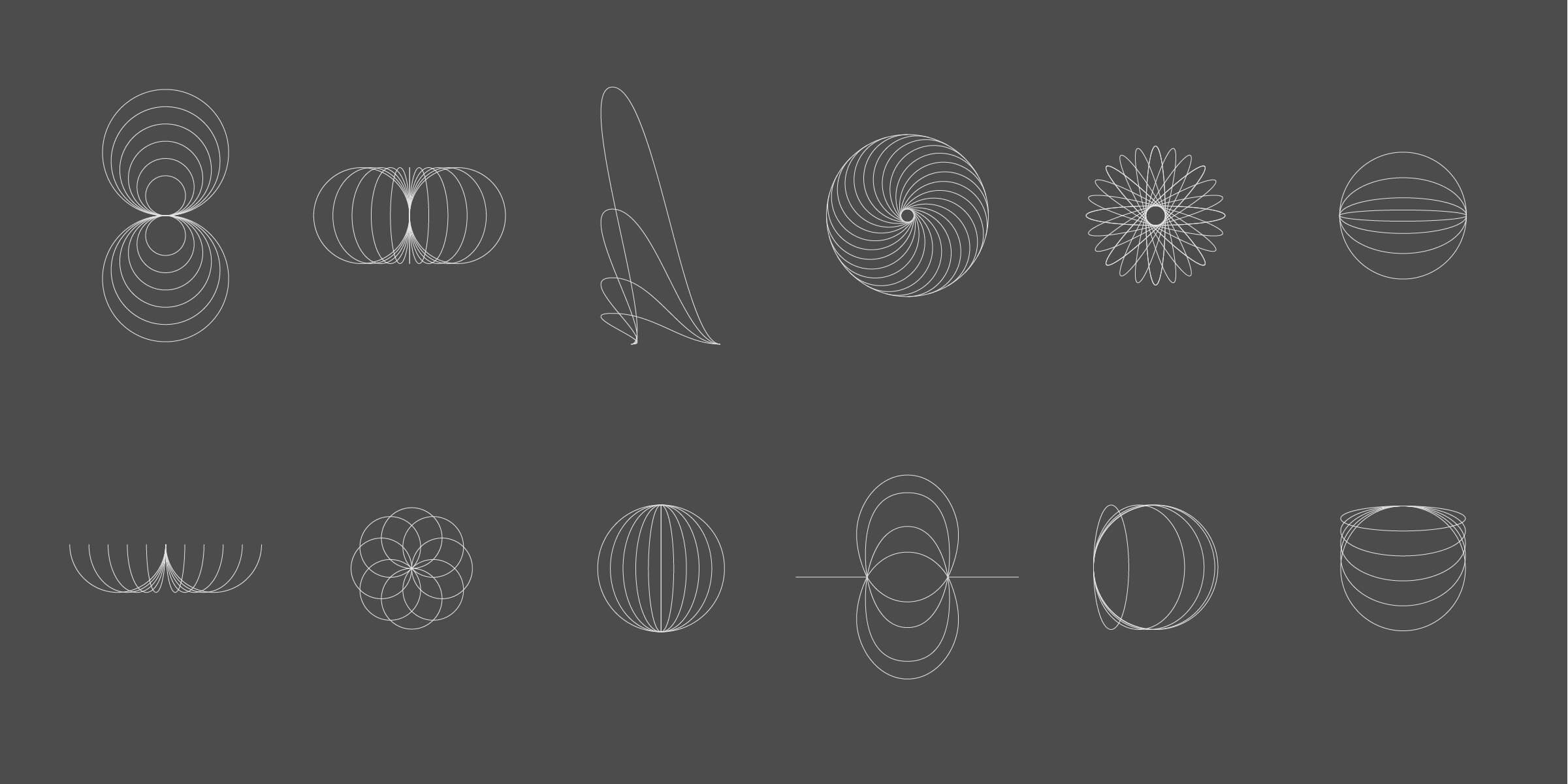
Finding ways to create different converging line patterns
Early on, I tested increasing or decreasing the number of lines, rotating, scaling, cropping, changing the line weight, different patterns, adding shadow or fill between lines, and adding other shapes to the lines. By doing this, I started to sift out rules that helped lead to a coherent system.
- Different line patterns should be made on a grid with consistent spacing, scale, and line weight
- Patterns could be rotated or cropped as long as they conveyed a sense of converging lines
- Color would be used to convey a sense of depth and energy
- Adding simple shapes to the colored lines diversified the system without detracting from its elegance and simplicity
The idea of energy or static being generated led me to create a set of line patterns using a grid and four corner points. The dynamic patterns familied well and were unique enough to allow for a wide range of crops.
With these line patterns, I began applying them to the primary use cases: email and web banners.
Hero colorways and crops were intended for global CX use-cases. I also created a set of accent colorways and crops for individual teams to use.
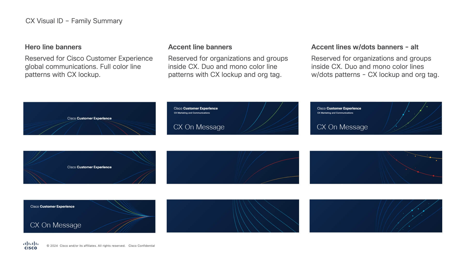
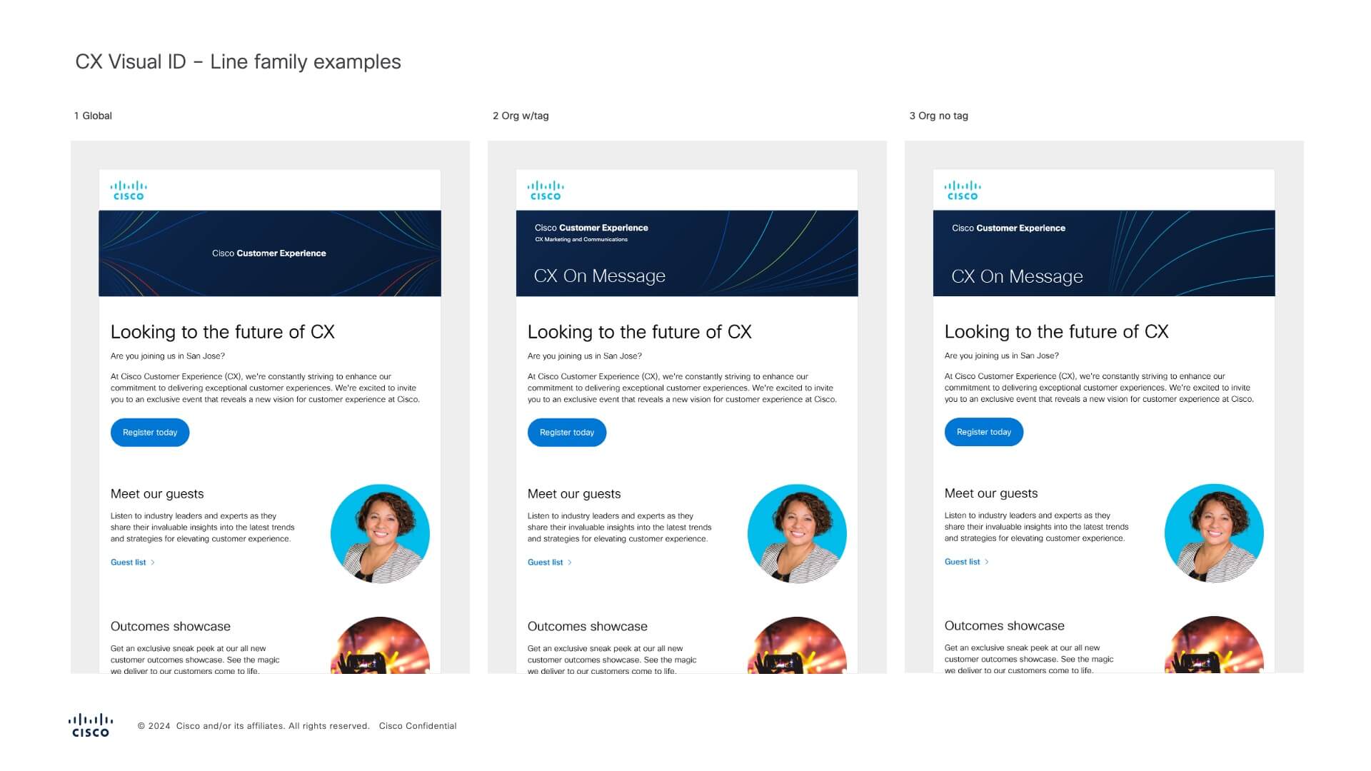
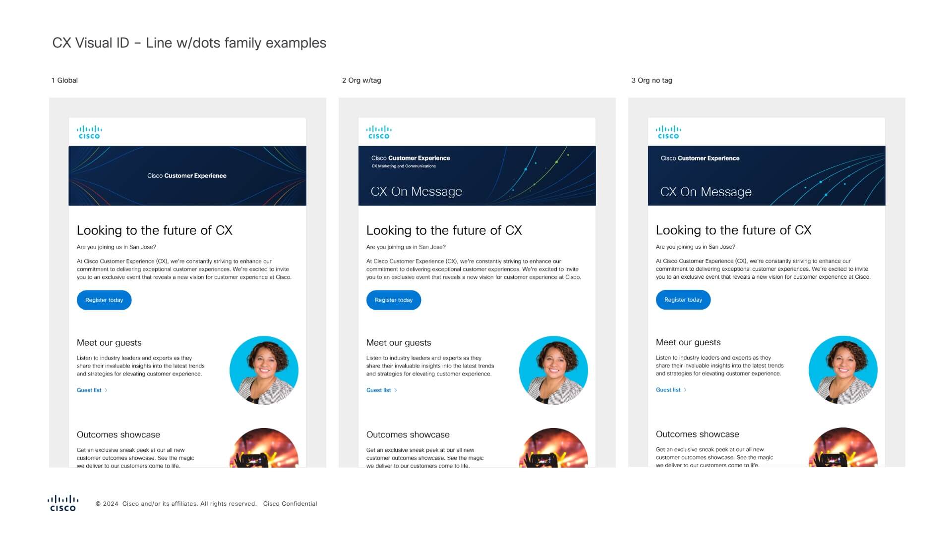

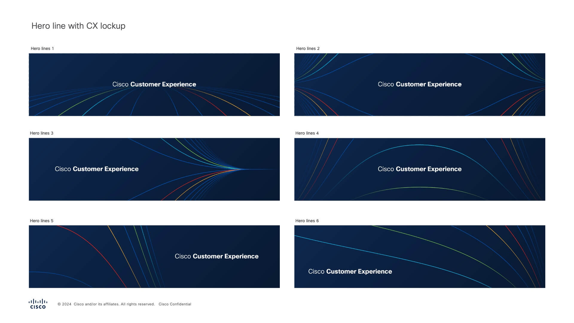
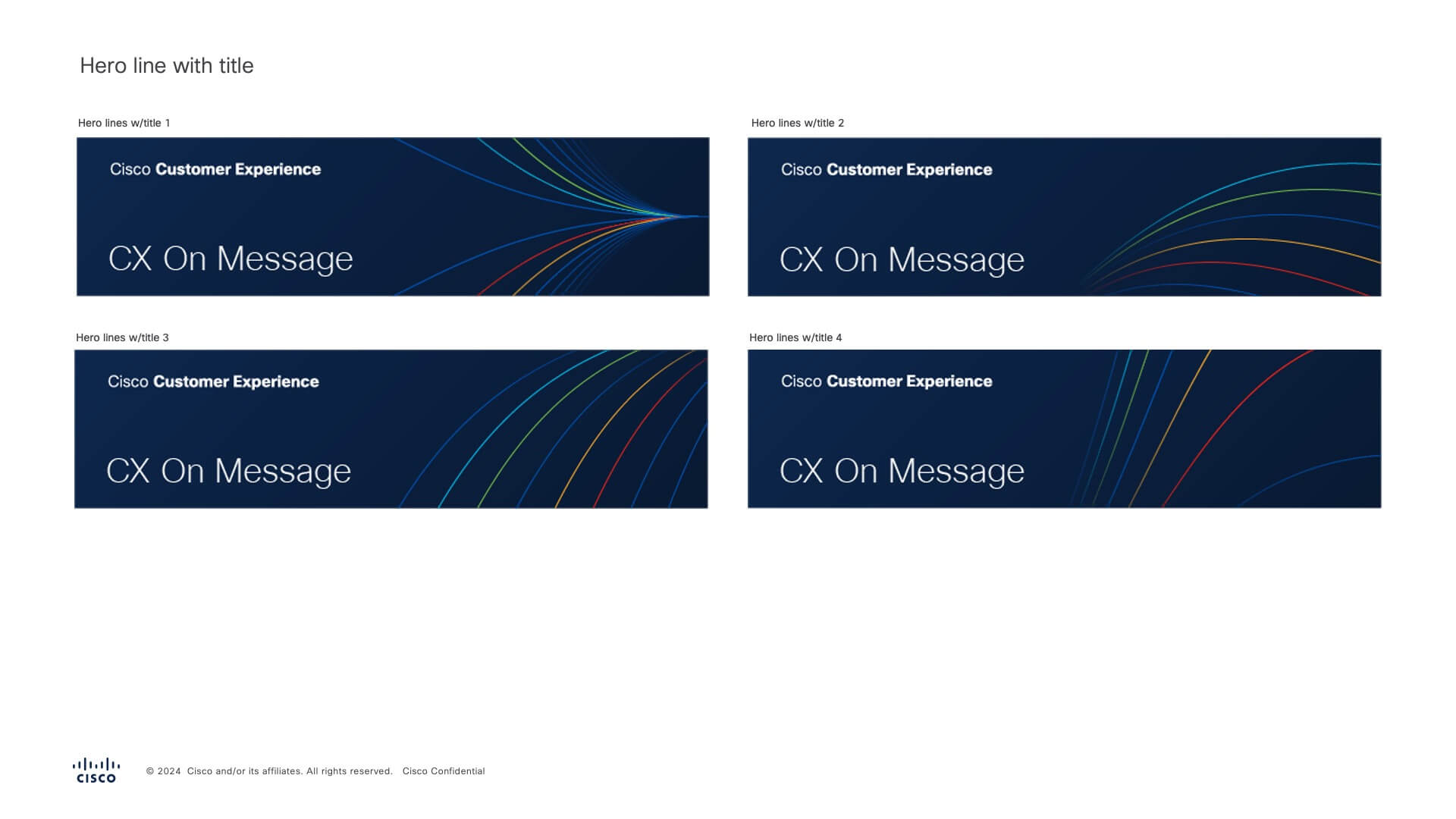
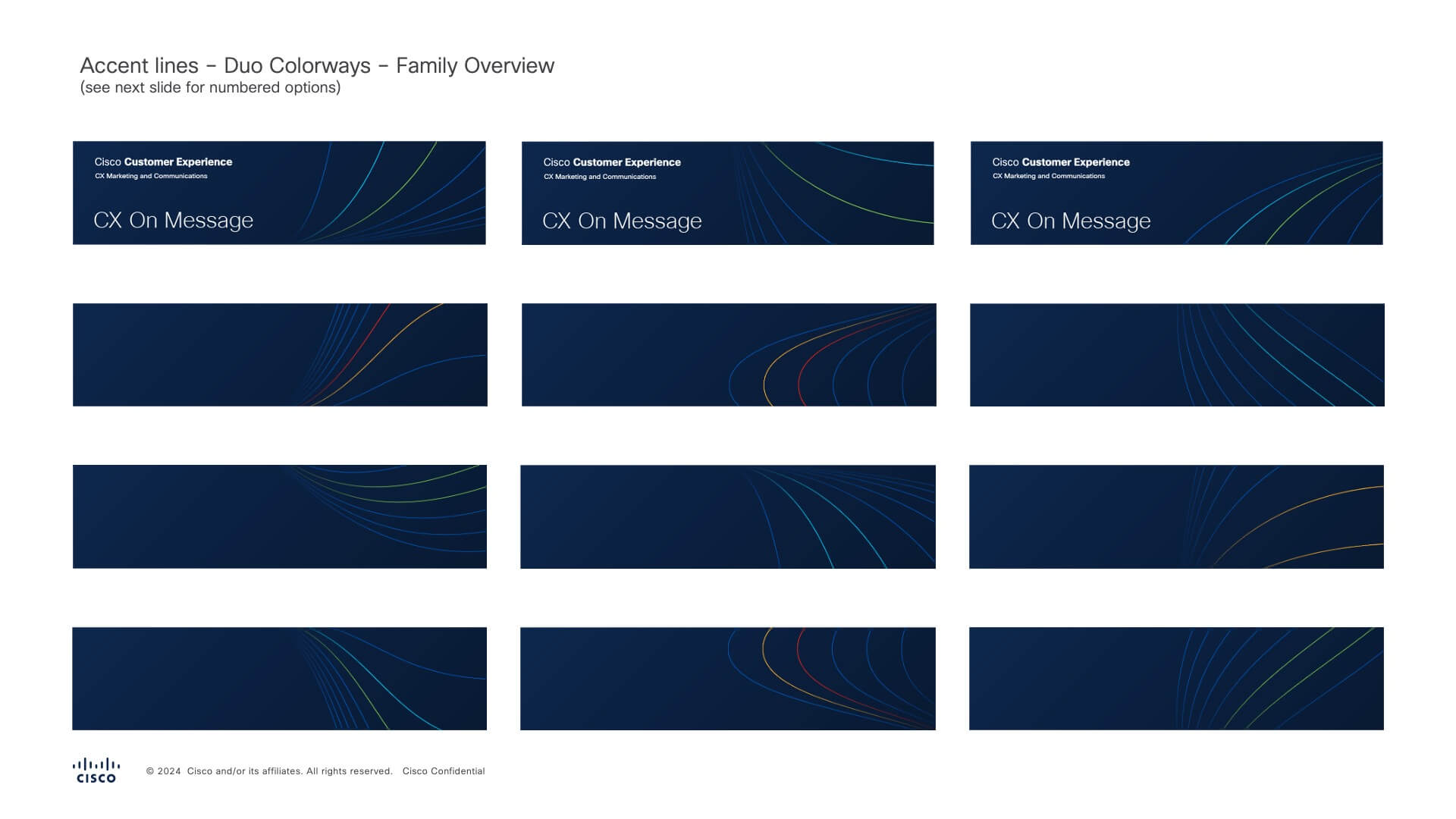
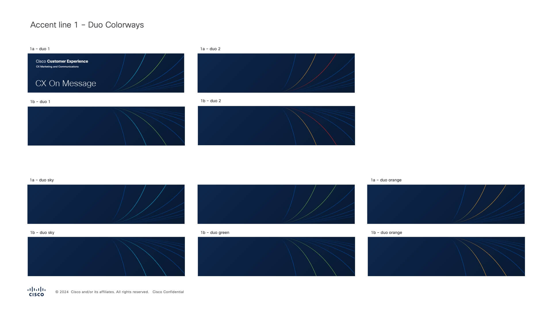


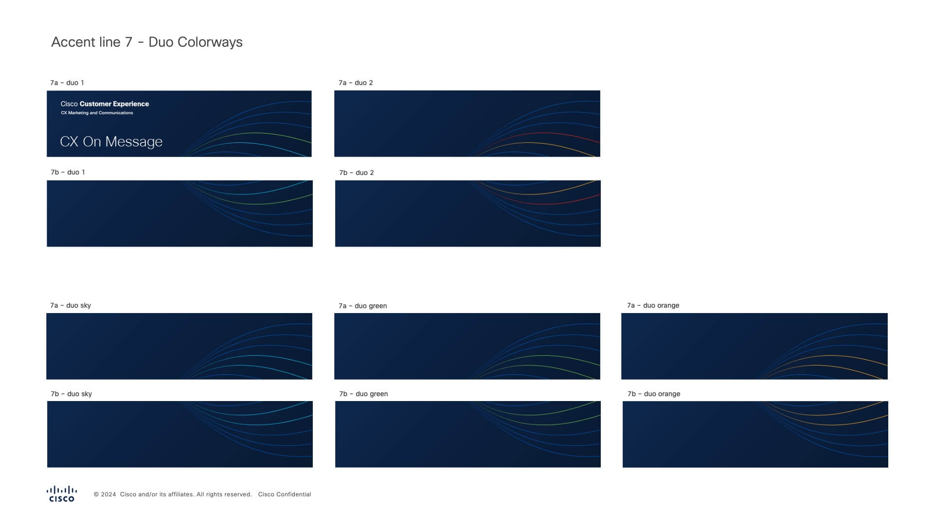

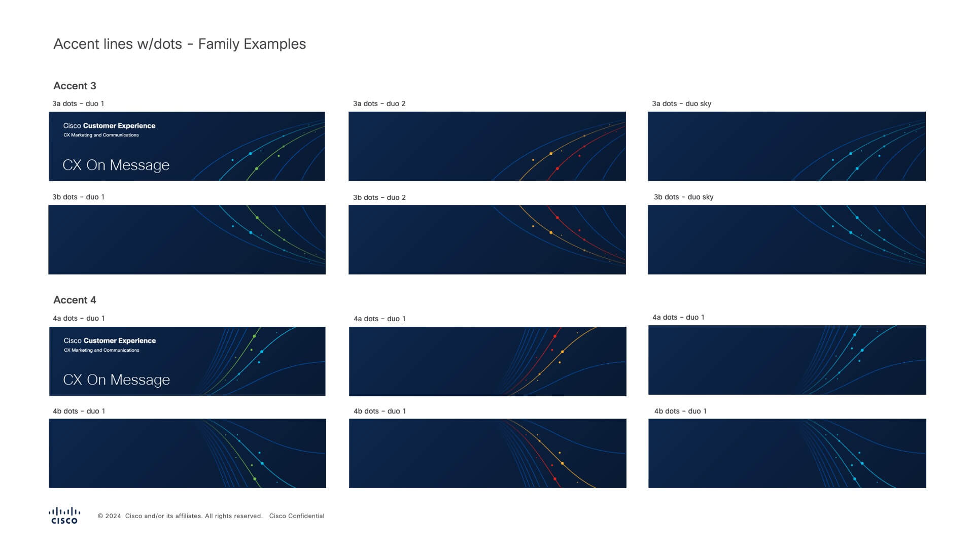
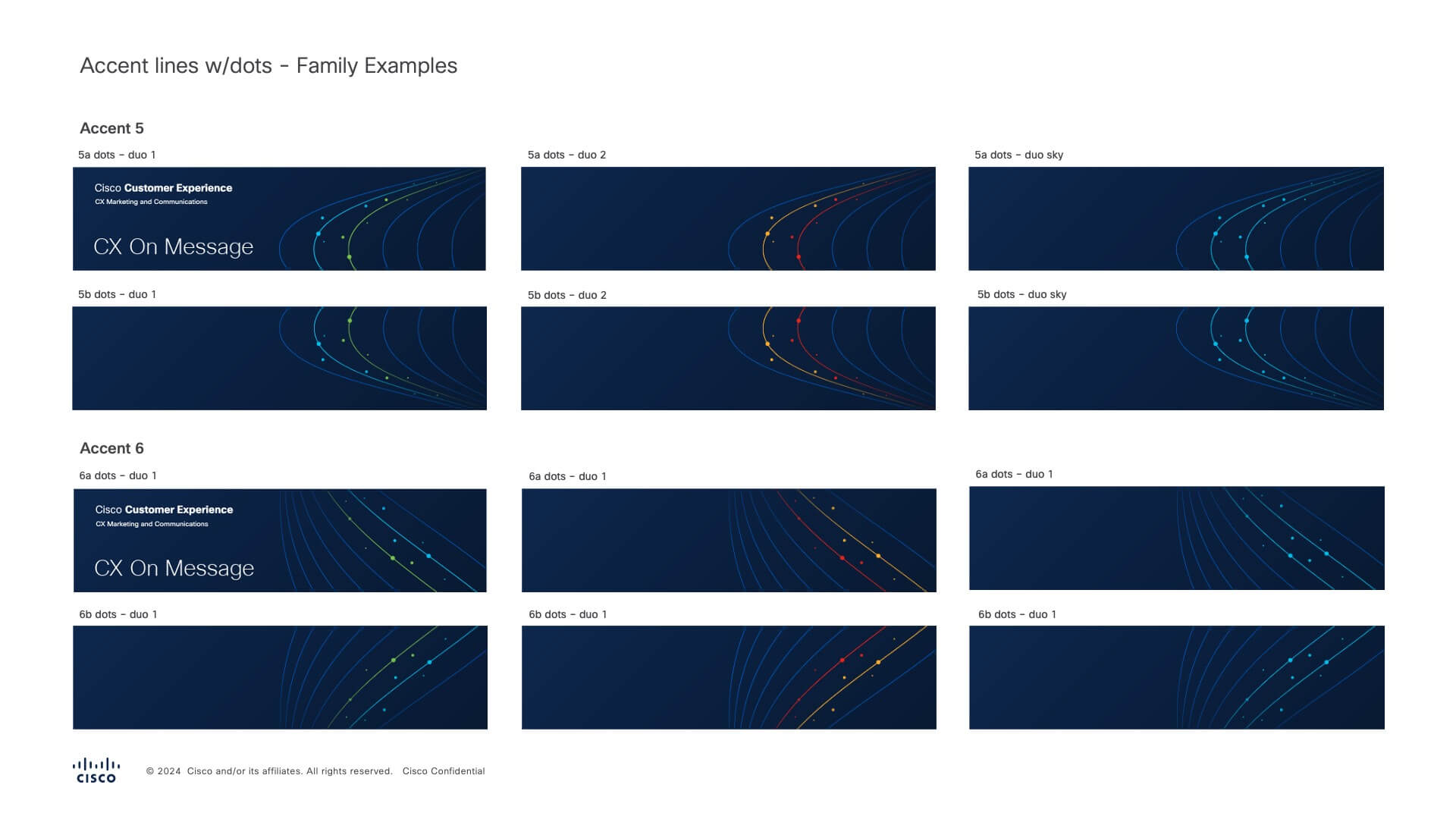
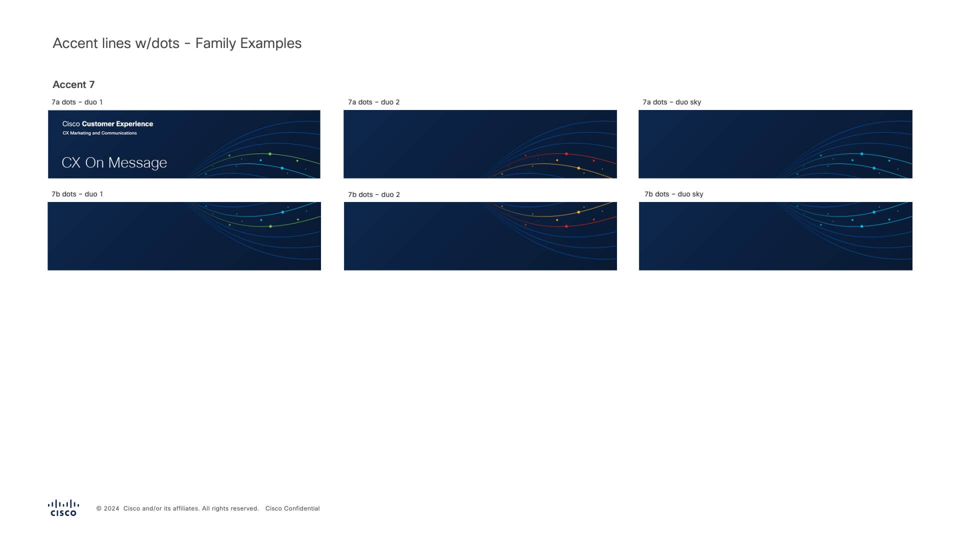
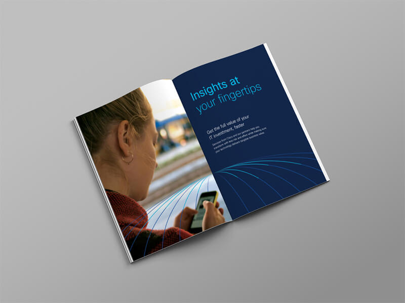
The Cisco Customer Experience visual identity represents Cisco's mission to provide one exceptional experience for our customers and partners through our diverse teams, services, and pathways to outcomes. The converging lines and CX text lockup form a dynamic and flexible system for CX teams to utilize internally.
The final step was developing a style guide and templates for teams to use accross Cisco.
Future Proof
A global identity with room to grow.
Collaborators
Creative Direction - Justyna Przygoda
© Luke Regan 2024


